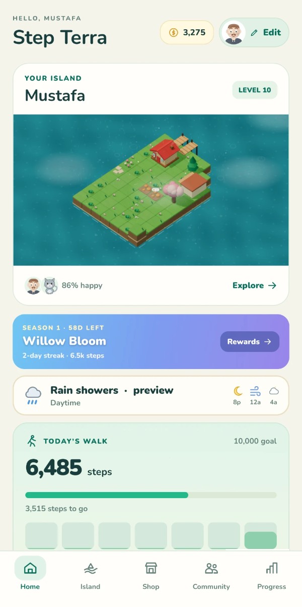
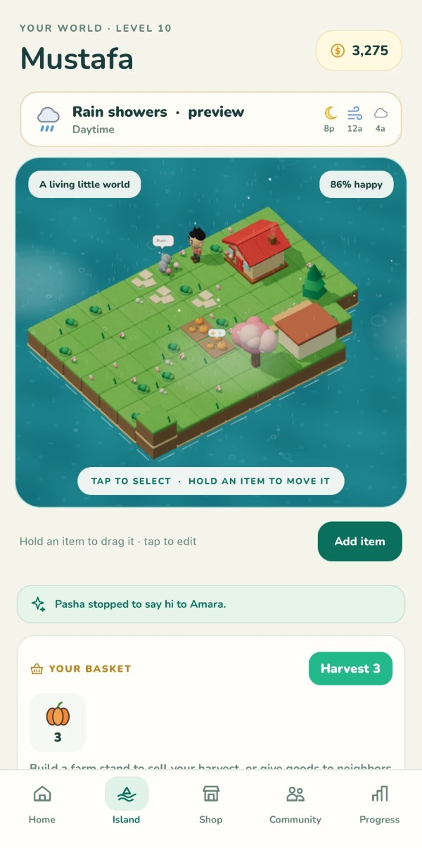
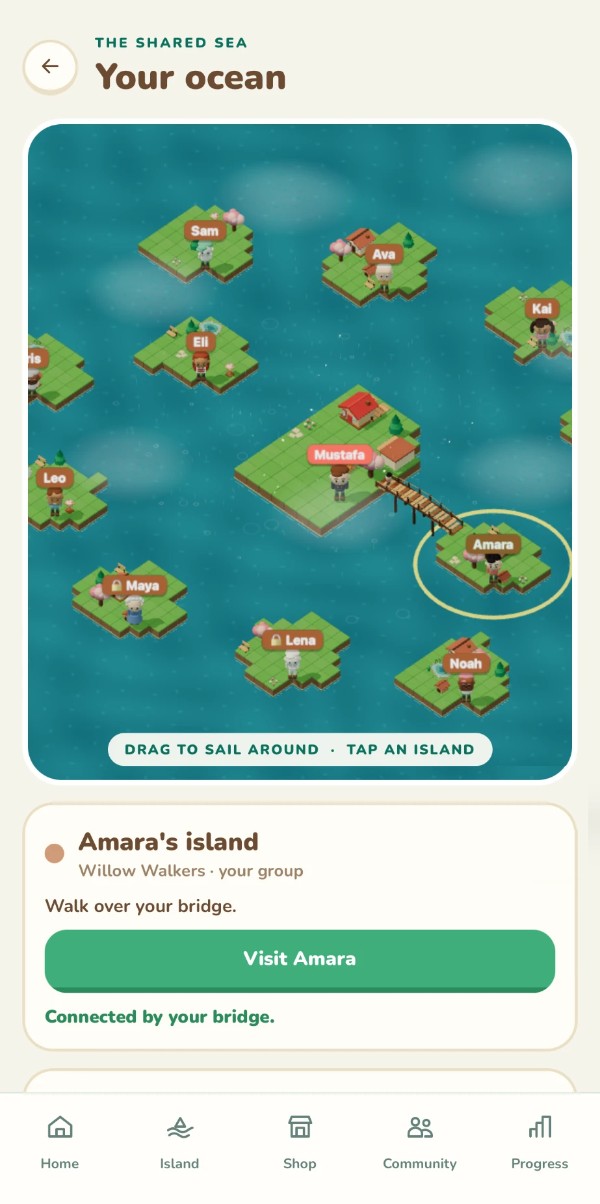
Each one is something you can see in the screens. The crops below are cut straight from the app, so you can check the design against the claim.
01
Teach the gesture where it happens.
The island carries its own cue, “Tap to select · Hold an item to move it”, and a second line sits right under the scene: “Hold an item to drag it · tap to edit.” The same rule appears in two places, so the interaction can be learned without a tutorial.
Seen on: Island
02
Progress that never scolds.
The big number is what you’ve done (6,485), the goal sits quietly in the corner, and the gap is worded as “3,515 steps to go.” It’s a distance still to cover, not a shortfall to explain. The week is a row of tiles with today filled in.
Seen on: Home
03
The weather is part of the world.
A compact strip says “Rain showers · preview” with the next hours as three small icons, and the rain is visible on the island itself. The forecast becomes context for your next walk, echoing the calm weather communication I explored in AERI.
Seen on: Home, Island
04
Wellbeing as a feeling, not a score.
The island’s mood is “86% happy”, sitting next to the faces of the person and the cat who live there, and captioned “A living little world.” It reads as a mood, not a dashboard, which keeps the app from feeling like homework.
Seen on: Home, Island
05
Social without pressure.
Friends are islands in a shared sea you sail around by dragging. A bridge means a real connection (“Connected by your bridge”), groups have names (“Willow Walkers”), and locked islands show a lock instead of vanishing. These screens show presence and connection rather than rankings.
Seen on: Community
06
A world that talks back.
System events become small stories: “Pasha stopped to say hi to Amara.” A basket holds your harvest, and the copy nudges toward generosity: sell it, or give goods to neighbors. Specific, warm microcopy does the job a notification badge would do elsewhere.
Seen on: Island