July
Android-heavy prototype
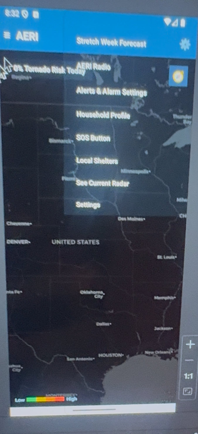
Fast implementation proved mapping, navigation, and severe context, but many actions competed on one surface.
- Note: strong technical proof.
- Note: weak hierarchy and crowded interaction points.
This page shows the actual progression screenshots with notes and mindset changes. July was mostly Android-first build work, August 28 improved structure, October introduced the main redesign, and the current-day build is the improved final version shaped by the pause-to-study phase and Expo Go workflow.
You paused after August because the direction did not feel right. That reset paid off: by October the design shifted from feature density to guidance flow, with clearer hierarchy and calmer decision support under weather stress.
July
Fast implementation proved mapping, navigation, and severe context, but many actions competed on one surface.
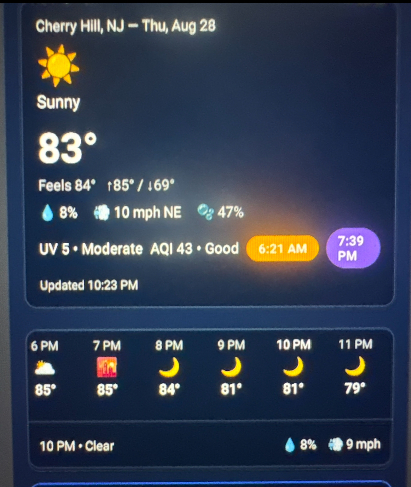
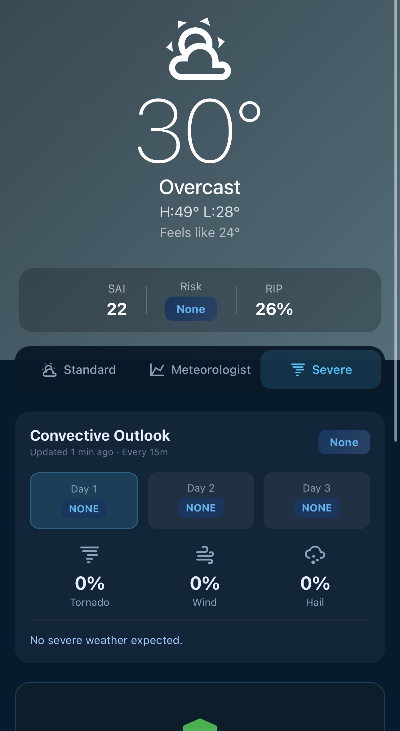
August 28
Current conditions and hourly blocks became clearer. Utility improved, but cross-screen consistency still needed work.
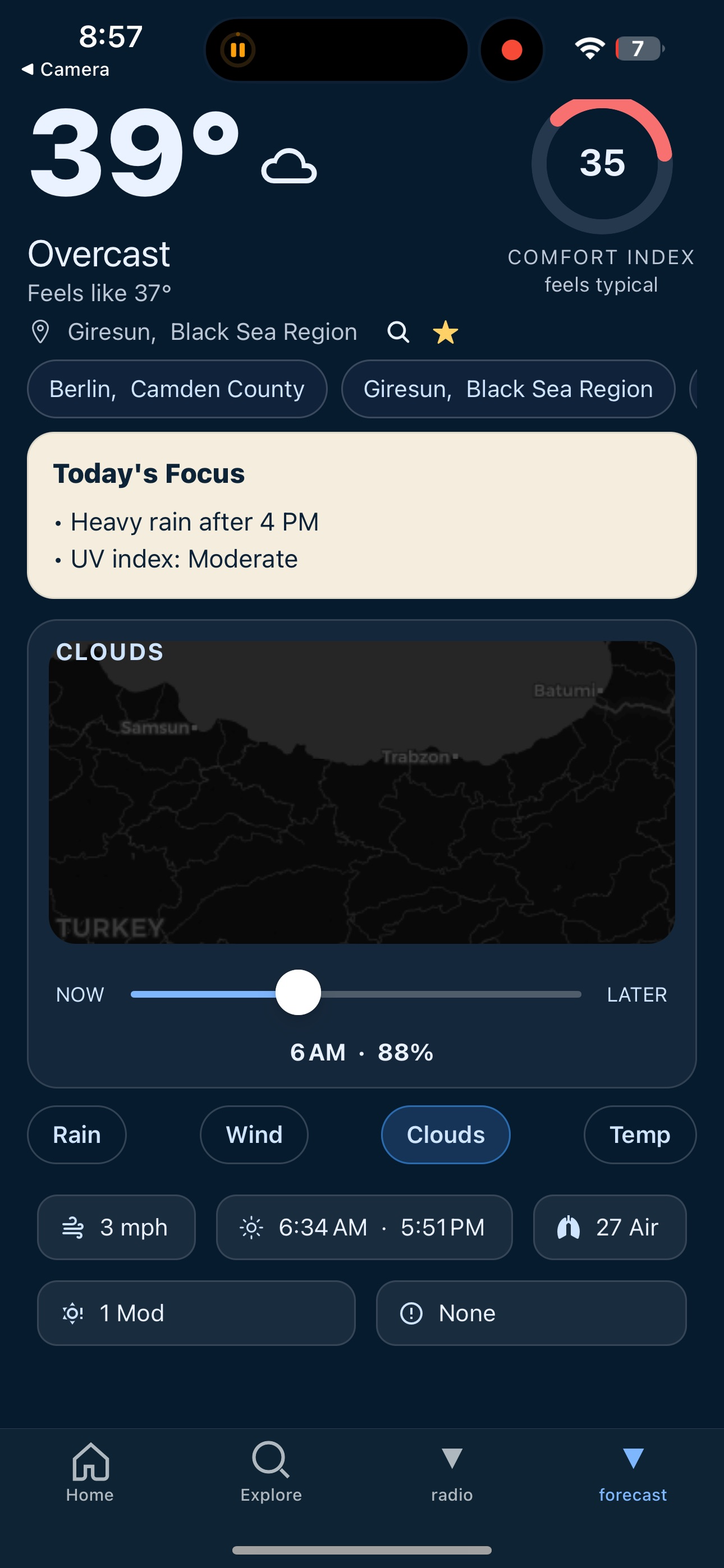
October Update
New flow introduced Today's Focus, mode switching, and better bottom navigation to guide decisions by context.
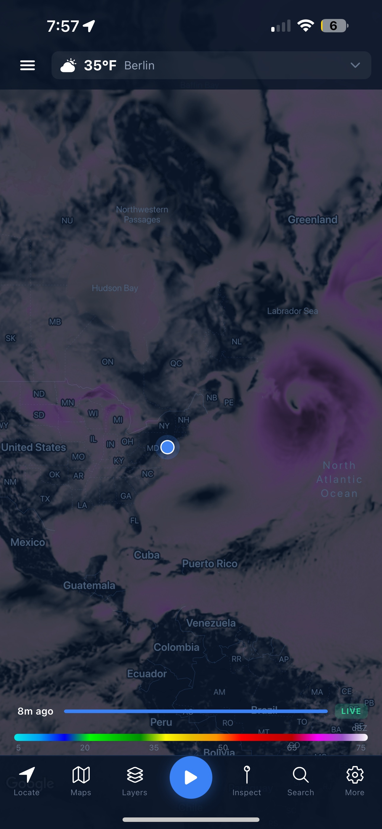
These are the exact screenshots you provided, organized as proof of progression. The October redesign appears first, followed by the improved final current-day mode and map screens.
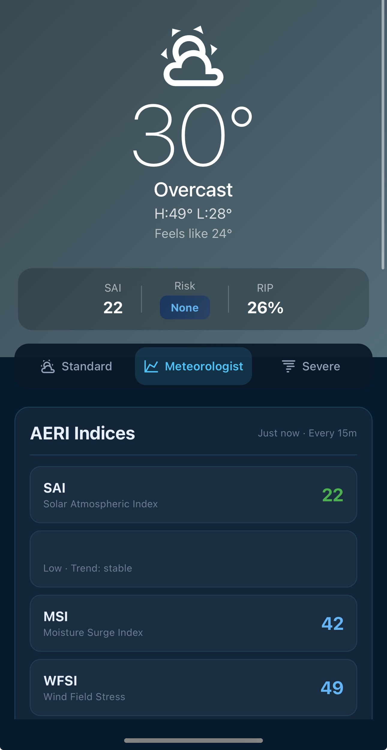
Surface the minimum needed first, then reveal deeper controls by mode. This lowers cognitive load without hiding expert depth.
In weather UX, confidence and clarity are core safety features. Grouping and contrast now support faster understanding.
Standard, Meteorologist, and Severe map directly to user intent, preventing one-screen-for-everyone overload.
The pause between August and October was not delay; it was research. Studying patterns before rebuilding improved outcomes.